![Joint Exploration of the Twilight Zone Ocean Network [logo]](/themes/jetzon-NOC8X/logo.svg)
We want you to get visual.
Images are a great way of communicating. They can be a very effective means of conveying even complex messages. It can help you see the bigger picture of your work and can be used in many different ways, from presentations to social media.
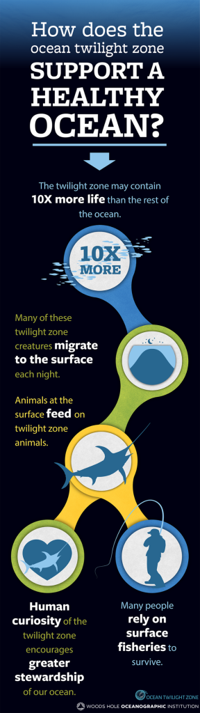
So, try making an "infographic" about your work. You don't need to be an artist. You just need to have a message you want to communicate. Below you can find a nice example, created by the WHOI Ocean Twilight Zone project.
If you have never tried this before, don't worry, here are 5 simple steps to getting started:
- Identify your audience. Is it for scientists, policy-makers, general members of the public...?
- Decide on your message. Keep it simple, focused, and remember your audience.
- Choose the minimum number of things you need to include to convey that message. Don't put in anything that isn't essential. Keep text to a minimum.
- Try doodling to see how things might fit together. You don't have to be a great artist. Use arrows, boxes, scribbles...anything just to work out how things could fit together on a page.
- Make a draft on your computer. Use images from the internet (check copyright) to replicate your sketch. You don't need anything more sophisticated than Powerpoint, or equivalent.
So, give it a go. The Comms team at NOC have kindly offered to provide feedback on any drafts you might want to share.
We'd be delighted to highlight any you create on the JETZON webpage and LinkedIn.
Example infographic:
- Log in to post comments